Logo
The building is a unique centerpiece in the heart of Mount Vernon, a culturally significant and historic part of Baltimore City. The building's architectural flair, provide character to the area and its inhabitants. From a design point-of-view, this became a unique selling point as it compares to other types of office buildings which may lack similar character. The logo represents the historic qualities of the building.
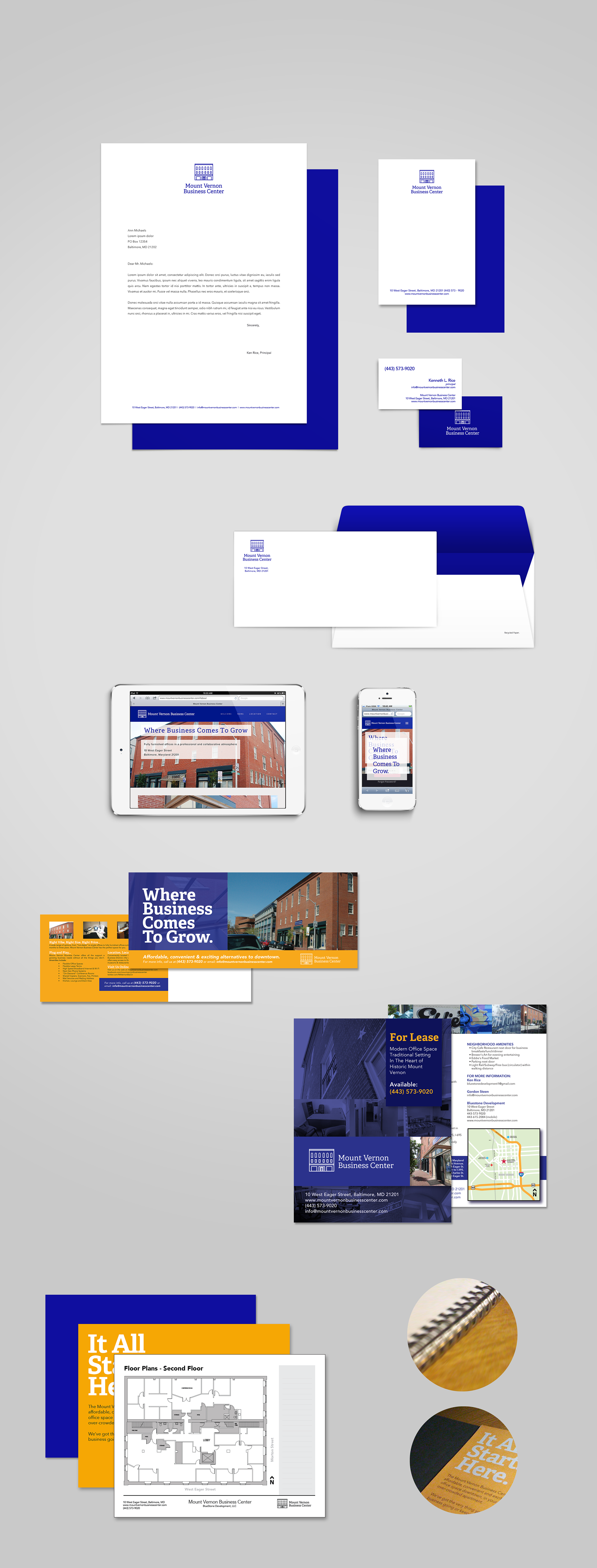
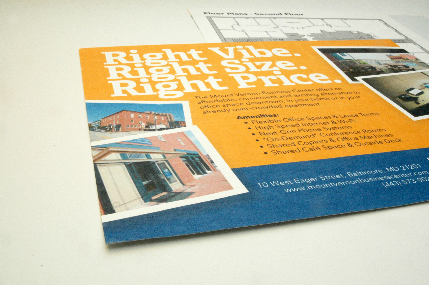
Stationery + Marketing Materials
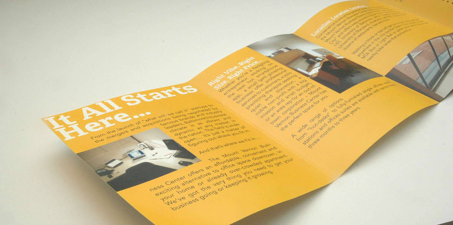
Various stationery items, as well as marketing items developed help to communicate the mission of the newly minted office building.
As for the application of the marketing items below, the website applies the logo in a horizontal format which is responsive to both tablet and phone views in addition to desktop computers. Below that, postcards, a broker's two-page sell sheet and a customizeable marketing packet allows the building representatives lots of flexibility in showing aspects of the building to potetential visitors with customized pages, including floor plans to highlight rented space, and coil binding with branded cover sheets that represent the building with panache, yet are budget-conscious.
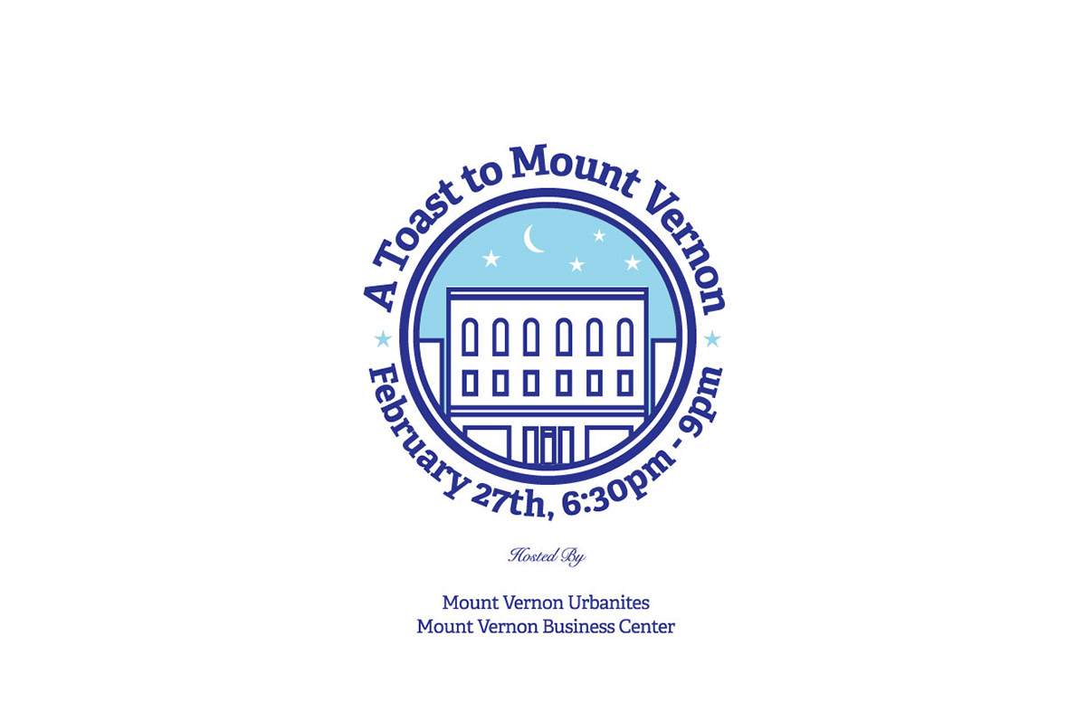
Special Event Logo — Urbanites Event
Event Logo developed in order to kick-off the opening of the building for a social organization that is local to the area—the Mount Vernon Urbanites. The event logo co-opts the building's logo design and places it under a night sky capturing the event's spirit, with refreshments and mingling activities on hand.
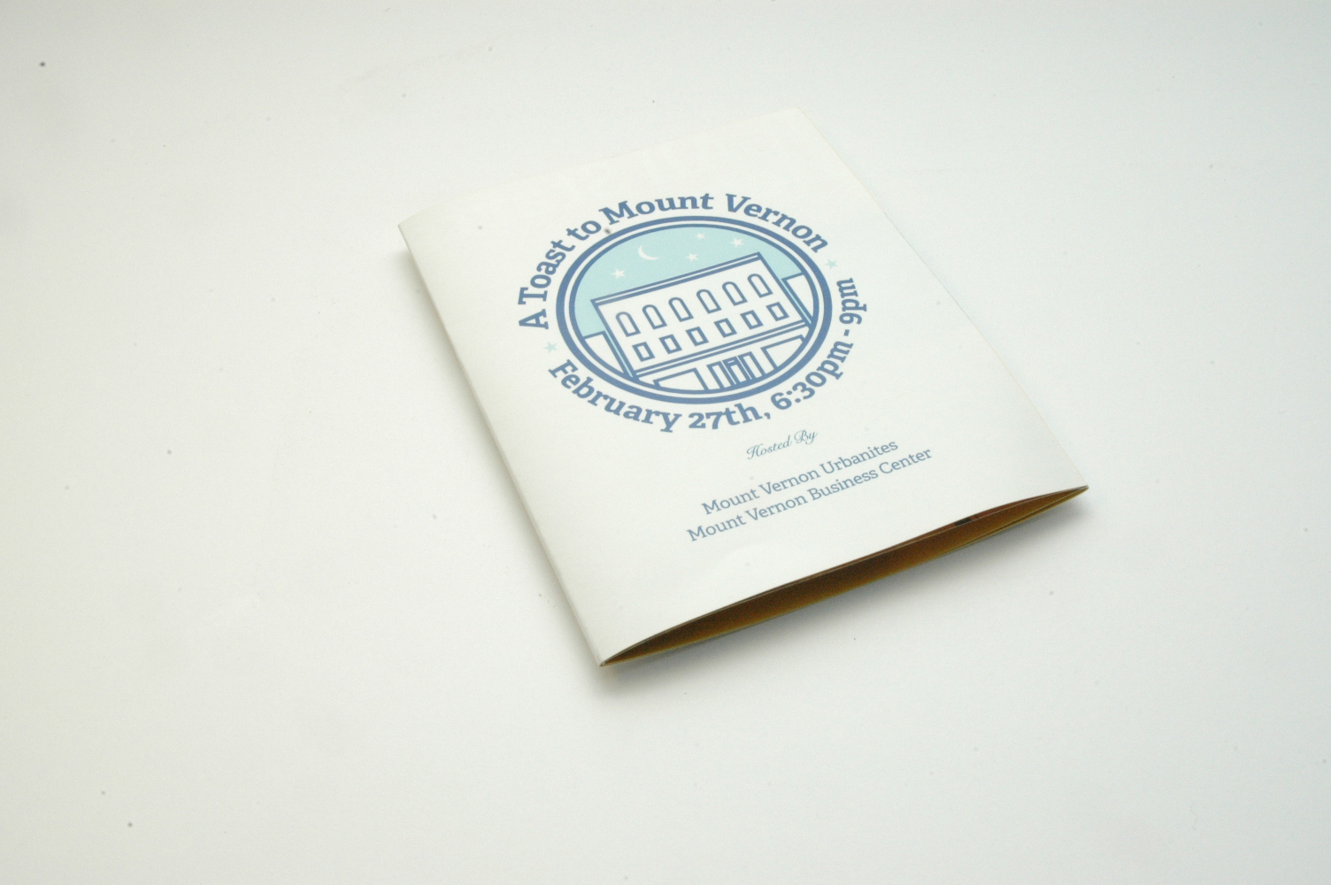
Event Brochure — Urbanite Event
Development of brand-consistent sub-brand identity and brochure design helped to kick-off the building's leasing in a soft opening event that occurred in late February 2014.
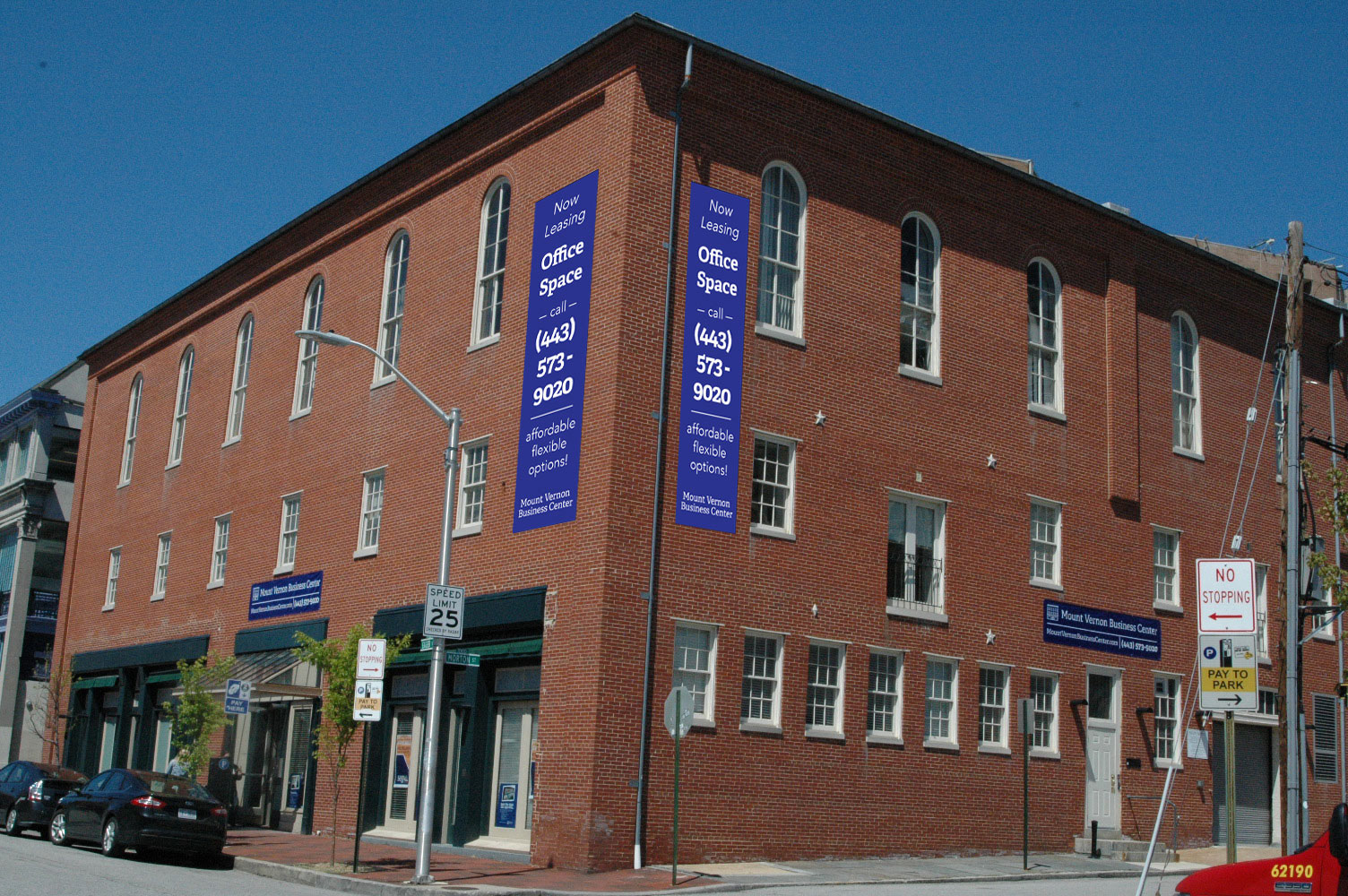
Environmental
Application of brand-consistent space banners shown below.